Showing posts with label decorating. Show all posts

Monday, April 2, 2012

the tv wall mount is done...

and we are loving how it looks....
the long term plan is to create some built-in shelves on either side of the fireplace.  my desk is on the right side and i am trying to find a design that we can do ourselves that will integrate a desk surface into the shelving.  the black tv stand on the left will be gone too, but we need something to house the tv components for now.  
here is a little breakdown of how we got this look.  
originally there was a mirror above the mantle.  i have always wanted built-in's on either side of the fireplace but could never figure out where to put the television.  mounting it over the fireplace was out of the question because we didn't want to have to drill through the wall and possibly mess with the chimney box behind the wall.  
then, i found this on pinterest and knew this might be the answer we were looking for. 
 we ordered mounting hardware for the tv and attached it to the wall.  i think that was the scariest part of the whole project because it scared the crap out of me to hang our tv to that little piece of metal.  we have a plasma tv and that sucker is heavy.  like really heavy.  i don't think that i slept soundly for the first few days after we hung it waiting to hear the crash in the middle of the night.  the mounting allows the tv to be pulled away from the wall about a foot, turned from side to side and tilt up and down.  i didn't touch it for a long time because i was sure that i was going to cause it to crash down.  it's really sturdy though and has been no problem at all. 
the original design inspiration used plastic lattice lath but we couldn't find that and used wood instead.  
we didn't have a specific plan. except for the one i drew on a piece of paper.  and because i am such a great artist...don threw it away, it was so good.   :)
anyway.....
we just kind of winged it.  we made a few small calculations for the placement of the vertical and horizontal cross slats and i have to say, that we did pretty good for not knowing what we were doing.  
the hardest part was trying to decide how to run the wood down the side of the fireplace.  because of the width of the mantle (which we had enlarged a couple of years ago) we didn't want there to be a huge gap between the fireplace columns and the wood slats.  had we run the long channels on the outside of the mantle, there would have been a 11 inch gap between the slats and the columns where the arrow is.  i felt that even though we were painting everything white, the dead space there would have looked out of scale.  so we lined up the inside slat flush with the mantle edge.  we had to be sure that the tract would be narrow enough for the top slat to cover the channel.  
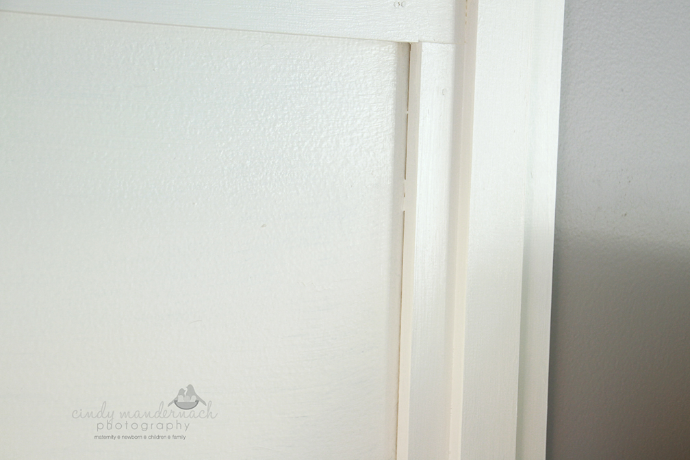
the outside slat placement had to be big enough to accommodate the cords and still be able to be covered by the top slat so we ended up notching out the piece of slat that covered the track so we could get the design closer to the existing fireplace moulding.  the gap is just 5 inches and once painted and caulked, doesn't look at all out of scale.
i know that this sounds confusing because it was confusing to write, so if you have any questions about how we did this, feel free to email me.  
here is a close up of how we notched it out.  
(sorry about the watermark right on the spot i wanted you to see).  
we then tested out how to place the cords to make sure that the channels were wide enough to accommodate them but still narrow enough to cover them with the top slat...
we looped the cords and attached them to the back of the television and the mounting frame so that there was some slack when the tv was pulled away from the wall or turned side to side.  the extra slack would prevent the cords from pulling the slat cover away from the track.   we used zip ties to attach the cords to the frame.  easy peasy..
we tested the length of all of the cords (for the tv itself, the cable box, dvd player and surround sound system) before attaching the track cover slats. 
 there is a little room left if we decide to add another component and have to run the cord through the channels....
the top slats are nailed with thin brad nails so if we have to get at the cords for any reason, they would be easy to pull off. 
 this area will be covered when we add bookcases.     someday.  
the rest of the tracks were designed to look like raised paneling.
 and the entire wall was painted to give the space a built-in look.
there were lots of gaps where the wood met the wall.  

 these were all filled with caulking.
while i was caulking, i almost fell off of the step stool when i saw this spider on the moulding up near the ceiling.  ( i hate spiders) i had to get the vacuum cleaner to suck it off of the wall because it was too high for the dog to reach.  he likes to eat spiders and i take total advantage of that.  for real.  he's weird....

we are really happy with how this turned out...
and we are, frankly, astounded that it looks so good!!! we realize that the tv is mounted slightly off center but we were limited by the placement of the wall studs.  the tv is so heavy that we had to be sure to attach the mounting hardware to the studs.  i'll just decorate to off-set it..we can totally live with it.
the cost of this project was a little more than most of the other projects we have done in the past.  the wood slats cost a total of about $120.00 but we couldn't find anything that would work for the look we wanted other than what we used.  it was $1.27 a linear foot and we ended up using about 90 feet.
we thought about adding a crown moulding at the top where the wall meets the ceiling, and actually bought some but i think we'll wait until the built-ins are done before we worry about that.
the mounting hardware and frame for the tv was a great deal on amazon  at $59.00.  we needed longer hdmi cables so we got 15 foot ones similar to these at $14.00.  they are cheap but they work great and saw no difference in picture quality when we changed them out.  we already had the caulking so that was free.  the paint (that we already had, too) was an oops paint from home depot for $5.00, but i didn't realize when i painted the wall that although the can said eggshell, it's more of a semi-gloss than what we originally painted the mantle with.  it's okay for now but i may eventually repaint it with a satin paint so it's not too shiny.
under $200.00 for such a big change in the room.
we love it.....

Thursday, March 15, 2012

i have some very talented friends {part 1}....

tina and jerry...
they used to live next door to us.  they moved in a couple of weeks after we did way back in 2000,  newly married and fresh off of their honeymoon.  they were the most fantastic neighbors and we became fast friends. tina has an incredible eye for decor and her house was an inspiring mix of modern design and vivid color. lots of black furniture with bright reds, cobalt blues, bright oranges and charcoal grey adorning the walls and accessory decor.   jerry loved working in the yard and landscaped with the same modern twist.  lots of hardscape with just the right mix of greenery.  and he turned the pond that we shared in the yard into more than just a retention pond by cleaning up the edges, rimming them with rocks and adding a fountain.
this gave all of the neighbors who bordered the pond a beautiful view out of our windows.
  
 they had two little girls while they lived here.  i've been taking their photos since eden, the oldest, was about a year old.   london, the youngest, is the picture of her mama and eden, her daddy....
they moved about two years ago and we miss them terribly.  although they only moved about 15 minutes away, time and life gets in the way and we don't see each other as much as we should. we are working hard on changing that.  
anyway,
tina invited me over to see the changes she has made in the decor of her home. she has changed her decor style drastically from hard modern to shabby, frenchy, vintage distressed.  and it looks fantastic. 
i want to take you on a little tour of her new home. 
daughter eden has a beautiful room done in pinks, golds and greys....
the bed linens are from target, urban outfitters, joann fabrics and t.j.maxx.   the angel wings are from hobby lobby.
 she made the lampshade above by tearing strips of fabric and tying them to the lampshade frame (which she picked up at the goodwill and tore off the old fabric from, a girl after my own thrifty heart) after painting the lamp white white.
most of the other wall decor is from hobby lobby as well.
 this is the playroom, located in the bonus room of the house over the garage, so it's long and narrow and split into two rooms.  perfect for two little diva girls....
i love the tulle draped from the corners of the ceiling to the chandelier. 

 daughter london has the blue room and if you notice, this is the same chandelier that i have in my laundry room.  tina fell in love with it and because it's no longer available from lowe's where i originally got it, she scoured craigslist until she found not one, but two of them....she painted hers too!!
she also added ribbon flowers to the candlelight bottoms
and although it's hard to see in this picture, she also added tiny ribbon flowers to the letters on the wall above her window.
bed linens for this room are from target, joann fabrics and t.j. maxx as well.
 tina is so creative that she found a design on pinterest and drew it freehand to london's wall.   the little feathers holding up the strands of pearls have lights behind them and the branches are bejeweled with stick-on gems.  
 these feather angel wings were found online.  they are gorgeous....
 the girls bathroom is beautiful too.  she is currently working on finding a sideboard like this one
that we redid a couple of years ago, to use as a sink base.  she keeps telling me that mine would be perfect for her girl's bathroom....i'm not ready to part with it just yet though, because it is actually the perfect size to use in our master bathroom as a sink base!  :)
 most of the linens here are from the rachel ashwell collection at target too.  she glammed everything up with some ribbon and feathers...
 even her laundry room has that frenchy glam look.  
 just look at the light that those chandeliers throw around the room....
 the furniture in her bedroom is a throwback to the modern look in her old house.  she wanted to purchase new furniture for her bedroom but i talked her out of it.  i knew i would be able to give her the look she wanted just by painting the orange wood and turn it into the new style of decor she wanted.  we worked on it for an entire day a couple of weeks ago and by the time we finished,  it was late at night so the pictures don't do it justice.  this is a before picture of her dresser and mirror.  i will share the finished pictures of her room in an upcoming post and i assure you that the furniture looks drastically different.  i just need to get back over there and get some pictures during the day....
i love having creative friends.  
we play off of each other and share ideas.  we inspire and push each other to get things done....and we look at our changes with big smiles on our faces....
we miss you guys bunches....

Monday, February 6, 2012

free storage....always a good thing......

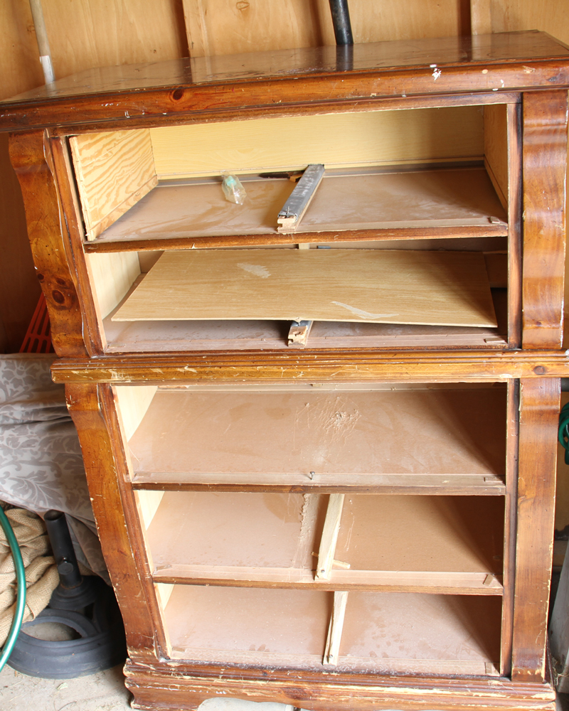
do you remember this piece of trash?.....literally, i pulled it out of someone's trash pile....
it was really rough, inside and out,  but i loved the curves and the sturdiness 
that comes with an older piece.
the edges were pretty chewed up but i knew a little sand paper would work wonders...


I used annie sloan paint in paris grey for the piece.  i figured it would be a neutral shelving unit and any color of fabric that was placed in there would show off as pretty.  
because we all need pretty in our lives, don't we?
 i love that all of my vintage sheets now have a beautiful home....
  to make it even prettier, i painted the shelves in a pretty turquoise. 
 i still plan on getting a piece of beadboard for the back which i will paint the same turquoise. right now i have a piece of wood covered in blanket fabric that i use for photography.  it's a perfect little niche to store that behind the dresser and it works for the backing right now.   
the shelves had to be cut in half though, because there was cardboard there before which was pliable.  the backer board that i replaced the shelves with was more rigid and the only way i would have been able to get them into their spot would have been to cut and remove the post in the back.
once the fabric is on the shelves, you can't tell that it isn't one piece.  
sometimes you just need to improvise to make your design plan work.
 the finish was distressed since it was so rough to begin with.  now it looks like the flaws are on purpose.....
crappy old dresser....0 dollars
beautiful storage for pretty fabric....priceless....


Related Posts with Thumbnails